CSS | Understanding CSS @keyframes and Animation Timing Functions
CSS animations are a powerful way to add dynamic and engaging elements to your web pages. They allow you to create smooth and visually appealing transitions between different states of an element. Among the various techniques available in CSS animations, @keyframes and animation-timing-function play crucial roles in defining animation behavior.
CSS @keyframes: Defining Animation Steps
The @keyframes rule allows developers to specify the intermediate steps or stages of an animation. With @keyframes, you can define how an element should look at various points during an animation. Let’s look at an example of a simple animation that moves an element from its initial position to the right by 600 pixels:
@keyframes moveforward {
    0% { left: 0px; }
    100% { left: 600px; }
}
In this example, we’ve defined a @keyframes rule named moveforward. The animation starts with the element positioned at left: 0px, and at the 100% keyframe, the element’s left property is set to 600px. As a result, the element will smoothly move from its initial position to 600 pixels to the right.
Animation Timing Functions: Controlling Animation Pace
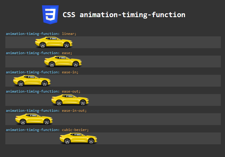
The animation-timing-function property determines the pace of an animation over its duration. CSS provides several predefined timing functions, each affecting the way an animation progresses. Here are some commonly used timing functions:
- linear: The animation progresses at a constant pace, creating a steady motion.
- ease: The animation starts slowly, accelerates in the middle, and then decelerates towards the end, creating a natural look and feel.
- ease-in: The animation starts slowly and gradually accelerates.
- ease-out: The animation starts quickly and gradually decelerates at the end.
- ease-in-out: The animation starts slowly, accelerates in the middle, and then decelerates towards the end, similar to ease.
Additionally, you can use the cubic-bezier function to create custom timing functions. The cubic-bezier function takes four values (P1, P2, P3, P4) between 0 and 1, allowing you to finely tune the animation curve.
Putting it All Together: An Interactive Example
Let’s explore a practical example that combines @keyframes and animation-timing-function. We have an element with the class .animate that will move forward and backward in an infinite loop, demonstrating different timing functions.
<!DOCTYPE html>
<html>

<head>
    <style>
        .animate {
            width: 128px;
            height: 40px;
            color: white;
            font-weight: bold;
            position: relative;
            animation-direction: normal;
            animation-iteration-count: 1;
            animation-delay: 1000ms;
            border: 0px solid white;
        }
        .forward{
            animation: moveforward 8s forwards;
            background-image: url("car.png");
        }
        .backward{
            animation: movebackward 8s forwards;
            background-image: url("car-rtl.png");
        }

        .track{
            position: relative;
            width : 728px;
            height : 40px;
            background-color: #444444;
            margin-bottom: 25px;

        }
        .timing-function{
            position: absolute;
            top: -19px;
            left: 0px;
            width: 280px;
            color: #76d1fe;
            font-family: monospace;
            background-color: #333;
            padding: 2px;
            border-radius: 3px 3px 0px 0px;


        }
        .timing-function span{
            color: rgb(233, 169, 85);
        }

        .content {
            width: 728px;
            margin: 0 auto;
            padding: 20px;
            background-color: #333;
            color: #76d1fe;
            font-family: monospace;
            border-radius: 3px;
        }

        .linear {
            animation-timing-function: linear;
        }

        .ease {
            animation-timing-function: ease;
        }

        .ease-in {
            animation-timing-function: ease-in;
        }

        .ease-out {
            animation-timing-function: ease-out;
        }

        .ease-in-out {
            animation-timing-function: ease-in-out;
        }

        .cubic-bezier {
            animation-timing-function: cubic-bezier(0.1, 0.7, 1.0, 0.1);
        }

        @keyframes moveforward {
            0% { left: 0px; }
            100% { left: 600px;}
        }

        @keyframes movebackward {
            0% { left: 600px; }
            100% { left: 0px;}
        }

    </style>

    <script>
       document.addEventListener('DOMContentLoaded', () => {
        // Get the animated element using its class name
        const animatedElement = document.querySelectorAll('.animate');

        // Add an event listener for the animationend event
        animatedElement.forEach((element) => {
            element.addEventListener('animationend', () => {

                console.log('Animation completed!');
                element.classList.toggle('forward');
                setTimeout(() => {element.classList.toggle('backward');}, 5);
            });
        });
    });
    </script>
</head>

<body>

    <div class="content">
        <div style="margin-bottom: 40px; display: flex; align-items: center; justify-content: center;">
            <img src="CSS3_logo.png" alt="CSS Logo" width="64px" height="64px" style="display: inline-block;">
            <h1 style="display: inline-block; margin-left: 10px;color:#fff">CSS animation-timing-function</h1>
        </div>


        <div class="track">
            <code class="timing-function">animation-timing-function: <span>linear;</span></code>
            <div class="animate linear forward"></div>
        </div>
        <div class="track">
            <div class="animate ease forward"></div>
            <code class="timing-function">animation-timing-function: <span>ease;</span></code>
        </div>
        <div class="track">
            <div class="animate ease-in forward"></div>
            <code class="timing-function">animation-timing-function: <span>ease-in;</span></code>
        </div>
        <div class="track">
            <div class="animate ease-out forward"></div>
            <code class="timing-function">animation-timing-function: <span>ease-out;</span></code>
        </div>
        <div class="track">
            <div class="animate ease-in-out forward"></div>
            <code class="timing-function">animation-timing-function: <span>ease-in-out;</span></code>
        </div>
        <div class="track">
            <div class="animate cubic-bezier forward"></div>
            <code class="timing-function">animation-timing-function: <span>cubic-bezier;</span></code>
        </div>
    </div>


</body>

</html>
In this example, we animate a car element using two @keyframes rules: moveforward and movebackward. The animation-timing-function is set for each element to showcase different timing functions.
The result is an interactive demonstration of how each timing function influences the element’s motion, providing a smooth, dynamic, and visually appealing user experience.